Google - Spring
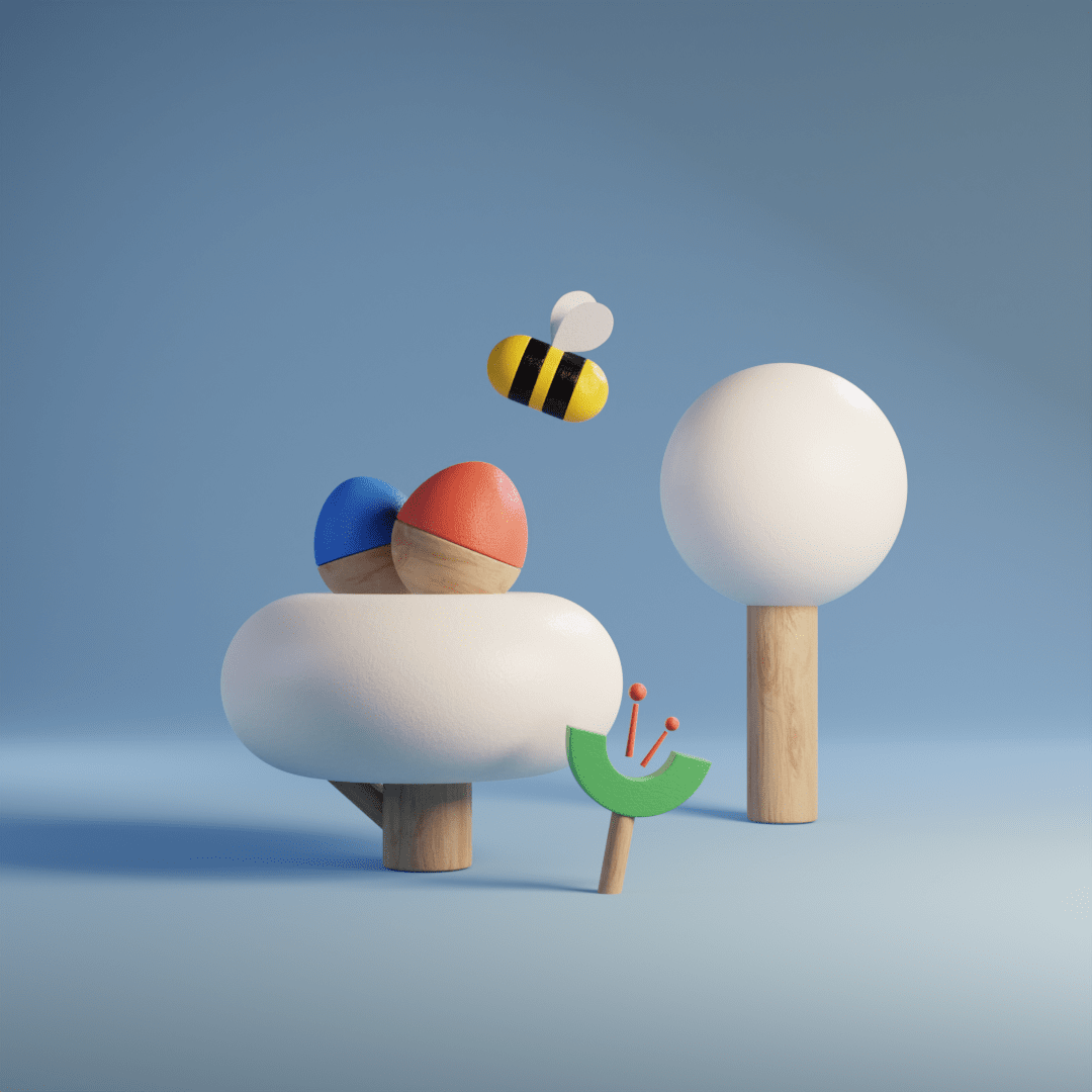
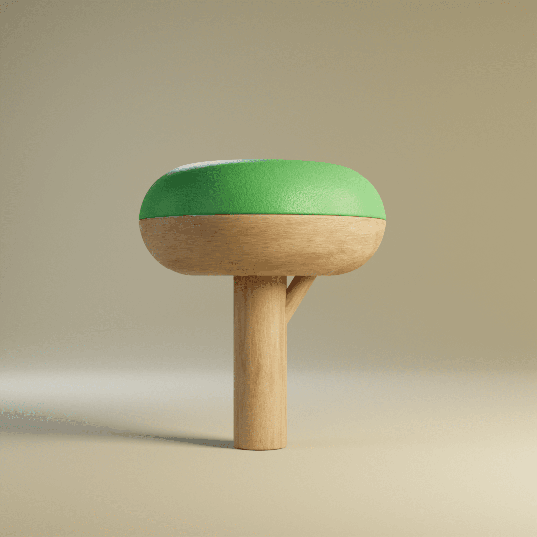
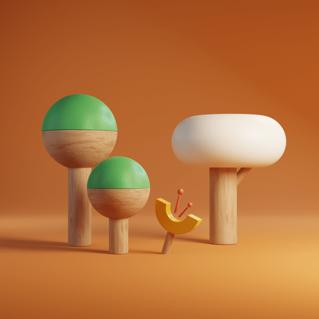
It’s always a joy when you get to create something for a well known brand, but having that brand be Google is something else completely. These illustrations, created for internal communications, allowed us to explore how Google’s brand and existing illustration systems could be translated into the third dimension.

Credits
The Ask
We were tasked with creating a series of illustrations to acompany internal communications around the concept of spring.
We wanted to push Google’s illustration style into new territory and explore how their brand could translate into a 3D illustration style. We explored different materials and modelling techniques to capture the geometric and whimsical nature of their 2D illustration systems and finally arrived at something that felt physical and unmistakably Google.
